- 22 Jan 2024
Our Geographical Information Systems (GIS) team was entrusted with cartographically representing each Urban Green project on a map.
From a consultancy perspective, this allows us to discern the spatial distribution of projects, identify voids or regions we have yet to work, and pinpoint areas where we have a substantial concentration of projects. Additionally, it offers our clients the opportunity to visualise projects throughout the UK, providing details about the projects, the teams involved, and the respective sectors. In this document, we will delve into the process of creating this map and explain the advantages of spatially cataloguing Urban Green projects.
Initial Steps
The project entailed meticulous planning. When crafting a map, it is imperative to tailor the data gathering and presentation to the specific needs of the target audience. Given that this map serves both internal and external purposes, we determined that a map featuring project points along with a heat map would be the optimal approach for data presentation. We chose to deploy the map as a web-based application, ensuring accessibility via mobile devices, web browsers, and tablets.
Subsequently, we embarked on the task of delineating the attributes of the project points. These attributes provide additional context to the point features. Within the point features, the following data was selected for inclusion: project name, disciplines, and sector. This approach enhances the user’s understanding of each project and facilitates interactivity when shared as a web-based map.
Data Compilation
The data within the Urban Green database and was stored in various formats, including PDFs, KMZ, .DWG, and shapefiles. The integration of these diverse data formats into the map presented varying levels of complexity. KMZ, shapefiles, and .DWG files seamlessly integrated into the map due to their inherent geographical information. Occasionally, data files were created using disparate coordinate systems, necessitating reprojection to align with our chosen coordinate system and ensure accurate geographical alignment.
Incorporating PDF information was a more intricate process. It involved reading the PDFs to identify site locations and subsequently adding point data to the map. The attribute information for each site was dispersed between our management system and the content of the PDFs. This required manual data editing to ensure the accuracy of each point feature on the map. Once all project points were accurately plotted on the map with corresponding attributes, we shifted our focus to symbology and enhancing the map’s visual aesthetics.
Symbology
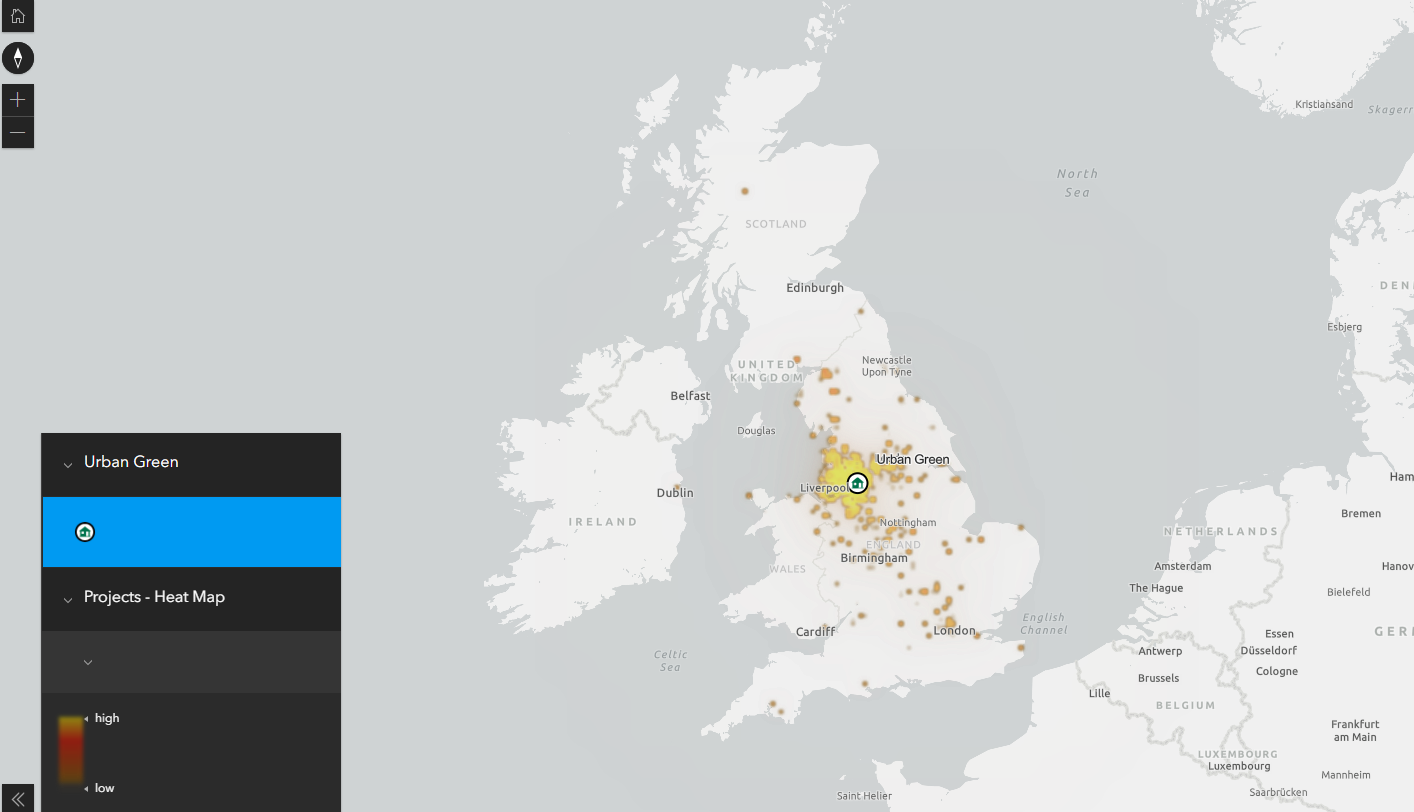
The choice of symbology on the map plays a pivotal role in enabling users to interpret the data effectively. We opted for two symbology types, each suited for different map scales. At higher scales, where the entire UK is visible, we employed a heat map to symbolise point features. A heat map employs colours, typically ranging from white to yellow to red, to represent data values, highlighting areas with higher data density in red. This visual coding enables users to discern areas with the most substantial concentration of projects.
Conversely, when the map is zoomed in to view towns and cities, point features are displayed as distinct points, each symbolised to denote its respective sector. This involved utilising the unique values tool, which allows the selection of an attribute field to categorise map features according to their attributes. In this case, the sector field was chosen for display. Each point was assigned a unique colour to represent its sector. The dual symbology approach allows users to gain a deeper understanding of the data; the heat map identifies areas with numerous projects, while, upon zooming in, users can view project names, locations, and sectors solely through visual cues on the map. Further granularity is available to users when they click on individual point features, revealing attribute information for each project.
Map Distribution
As the final stages of map distribution, several factors warrant consideration. Thoughtful planning should determine the preferred format for the final map. Maps intended for PDF or print should incorporate all information intended for reader attention directly on the map. However, this static approach precludes interactivity. Therefore, any data stored within attributes should be presented on the map to ensure accessibility.
In contrast, sharing the map as a web-based application allows access across a range of devices with internet connectivity. This ensures users can access the map whenever they have internet access. The web-based map format empowers users to interact with the data, explore attribute information, and gain a more profound understanding of the dataset.
Exploring Urban Green’s Projects on the Web Map
In conclusion, the comprehensive mapping of Urban Green projects not only aids in visualising our extensive portfolio but also empowers us with invaluable insights into project distribution and density. The utilisation of diverse data formats and meticulous planning has resulted in a dynamic web map that offers both internal teams and clients a deeper understanding of our work. To explore the full range of Urban Green projects, we invite you to visit our interactive web map at:
Explore the Interactive Project Map
Experience the power of spatial representation as we continue to grow and shape sustainable environments.